Twitter bootstrap is a front end framework that helps rapidly develop responsive web apps. Everybody says it is awesome, so I thought it was time to explore what it does.
I started by downloading it from Twitter Bootstrap Website. Twitter Bootstrap depends on jQuery and requires an HTML5 doctype so make sure your page has both.
The grid
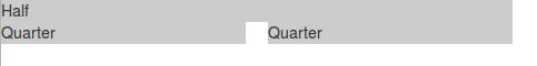
Bootstrap uses a 12 columns grid by default. You can create a row by adding the class .row to a div and create columns using the class **.span
1
2
3
4
5
<div class="row">
    <div class="span6">Half</div>
    <div class="span3">Quarter</div>
    <div class="span3">Quarter</div>
</div>
For the example below you get a 3 column page that accommodates the columns when you resize the window:

By default the grid will adapt to be 1170px wide, but you can make it completely fluid using the .row-fluid class. This configuration will expand or collapse your row to use the whole space without breaking the row:
1
2
3
4
5
<div class="row-fluid">
    <div class="span6">Half</div>
    <div class="span3">Quarter</div>
    <div class="span3">Quarter</div>
</div>

Styles
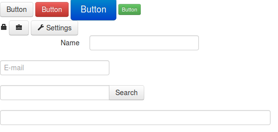
Bootstrap provides a lot of styles for base HTML elements that make for an easy to build nice looking UI. You can find all about it on the Bootstrap Base CSS documentation. Here are some examples:
1
2
3
4
5
6
7
8
9
10
11
12
13
14
15
16
17
18
19
20
21
22
23
24
25
26
27
28
29
30
31
32
33
34
<!-- Buttons -->
<div>
    <a href='#' class='btn'>Button</a>
    <a href='#' class='btn btn-danger'>Button</a>
    <a href='#' class='btn btn-primary btn-large'>Button</a>
    <a href='#' class='btn btn-success btn-mini'>Button</a>
</div>

<!-- Icons -->
<div>
    <i class='icon-lock'></i>
    <a href='#' class='btn'><i class='icon-briefcase'></i></a>
    <a href='#' class='btn'><i class='icon-wrench'></i> Settings</a>
</div>

<!-- Forms -->
<form class='form-horizontal'>
    <div class='control-group'>
        <label class='control-label'>Name</label>
        <div class='controls'>
            <input type='text'>
        </div>
    </div>
    <div class='control-group'>
        <input type='text' placeholder='E-mail'>
    </div>
    <div class='input-append control-group'>
        <input type='text'>
        <button class='btn'>Search</button>
    </div>
    <div class='control-group'>
        <input type='text' class='input-xxlarge'>
    </div>
</form>
The rest
Besides basic styling basic HTML elements for you Bootstrap also provides a bunch of components that are commonly used on the web, like navigation bars, progress bars, breadcrumbs, pagination which you can learn more about in the components documentation.
It also provides more advanced components that need JavaScript to work, like tabs, modals, carousels, typeahead, etc, which you can also learn about in the JavaScript components documentation.
Conclusion
When I first heard about bootstrap for some reason I thought it was another JS framework, but now that I have taken the time to look at it I realize that it is more like a style guide you can use to quickly build a web application. This ended up being a really fast introduction because their documentation explains all their features pretty well, so if you are interested I encourage you to take a look.
css javascript